Incoming Rolex Explorer II v. Outgoing Explorer II
Design Analysis and Comparison
Night & Day Design Detail
Bravo Rolex!!!!!!!
The incoming all-new 2011 Rolex Explorer "Orange Hand" really is Night and Day compared to it outgoing predecessor as you can clearly see in the photo comparison below. Rolex changed the dated "Logan's Run" typeface on the bezel and made it smaller and bolder, which gives the watch a much more streamlined look.
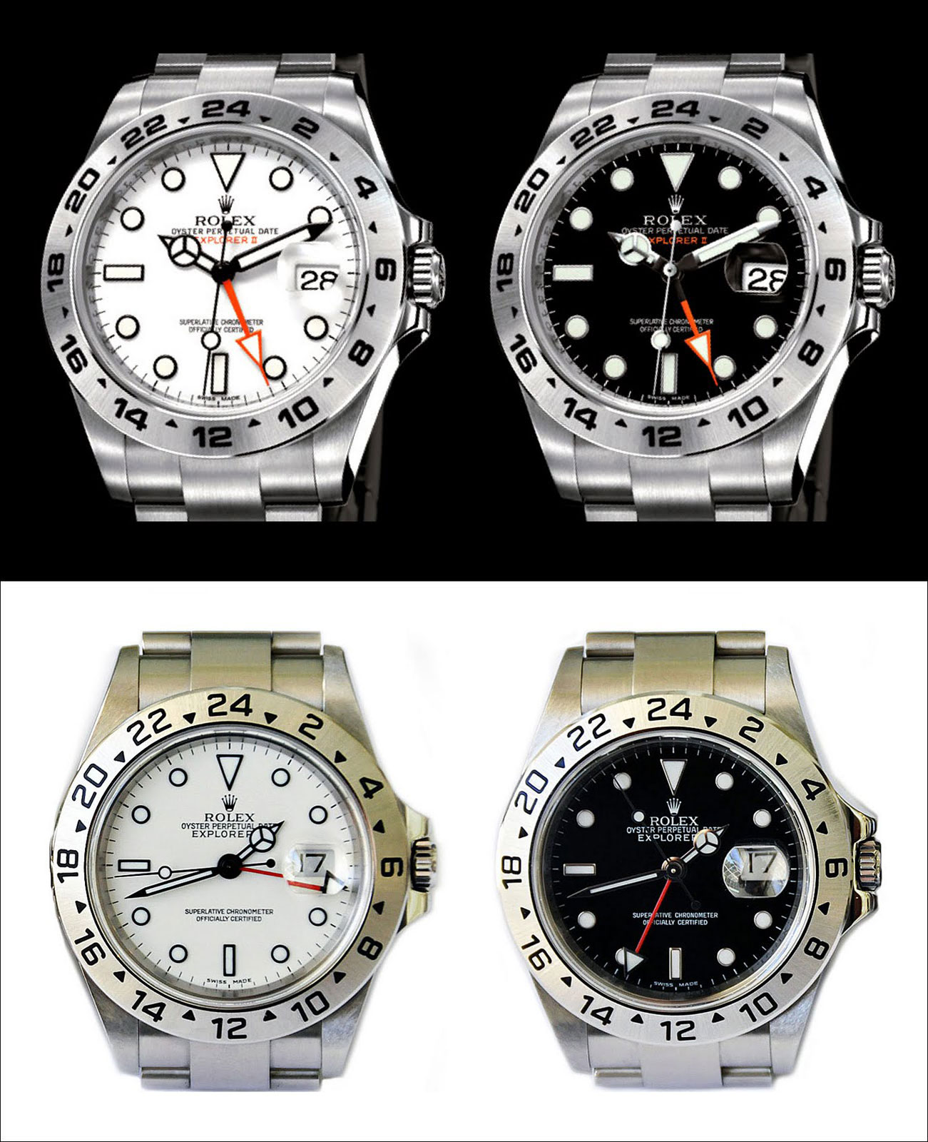
The 2011 version has the much fatter and bolder hour and minute hands, and the "retro" safety orange arrow hand is also bolder and more outstanding that the classic version. To my design mind, the hands and markers on the outgoing Explorer II look skinny, feminine and anemic. The new hands and markers look bold, masculine and strong. It is really amazing how such subtle design changes, complete change the vibe and look of the watch!!!!
It is really not until you examine the incoming v. the outgoing images that you realize just how different these watches look. You also really can't help but notice how much bolder the Maxi-Markers look, and it looks like Rolex also fattened up the twin-lock winding crown. Also, the all-new 2011 Explorer II has its "EXPLORER II" designation printed in orange on the dial, which give it a bolder, sportier look!!!